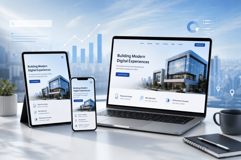
Responsive Website Designing in Dwarka for Better Google Rankings
16 May, 2026
A business website today needs to do more than look professional on a desktop screen. When a customer searches for a service in Dwarka, the first interaction with a business may happen on a smartphone, often while comparing several companies at the same time. If the website is difficult to read, slow to open, or awkward to navigate, the visitor may leave before understanding what the business offers. Responsive website design solves this by creating a website that adapts naturally to different screen sizes while keeping the content, navigation, and enquiry options easy to use.
For businesses targeting customers in Dwarka, responsive design is also closely connected with the wider SEO strategy. A mobile-friendly layout makes it easier for visitors to explore service pages, read important information, and contact the business without unnecessary friction. It also gives search engines a cleaner and more accessible website structure to understand. However, responsive design alone does not guarantee higher rankings; it works best when combined with useful content, good technical performance, relevant local pages, and a clear internal linking structure. Businesses looking to strengthen their local presence can also explore a dedicated Website Designing Company in Dwarka service page to understand how a professional business website can be structured around local search and customer enquiries.
The real advantage of responsive website designing is that it connects design, usability, SEO, and conversion in one experience. A visitor should be able to open the website on a phone, quickly understand the service, move to the relevant page, and take the next step without fighting with the layout. At the same time, supporting areas such as page speed, mobile usability, internal links, and local relevance should work together rather than being treated as separate SEO tasks. This becomes especially important for businesses competing in Dwarka, where a strong website experience can help turn local search visibility into genuine customer enquiries.
Why Responsive Website Design Matters More Today
A few years ago, many businesses treated desktop design as the main priority because customers were more likely to browse websites from larger screens. That approach no longer fits how people use the internet. Today, a customer looking for a local service in Dwarka may discover a business through Google, open its website on a smartphone, compare it with two or three competitors, and decide within a short time whether the company looks worth contacting. The website therefore needs to work well at the exact moment when the customer is making that comparison.
A responsive website is not simply a smaller version of a desktop website. The layout, content, buttons, images, forms, and navigation should adjust naturally to the screen being used. A visitor should not need to zoom in to read text, move sideways to see a section, or search through a complicated menu just to find a phone number or service page. A strong responsive experience should make the important parts of the website easy to access, including:
Readable content without unnecessary zooming or horizontal scrolling.
Comfortable navigation that works naturally on smaller screens.
Easy-to-use buttons and forms for calls, enquiries, bookings, or quotations.
Properly sized images that do not make important pages unnecessarily heavy.
Consistent layouts across smartphones, tablets, laptops, and desktop screens.
This matters even more for businesses competing locally because customers have plenty of alternatives. If one website opens smoothly and clearly explains its services while another feels outdated or difficult to use, the visitor does not have much reason to stay and solve the problem. The mobile experience becomes part of the business's first impression. A professional responsive website can therefore support trust, engagement, and the customer journey while making it easier for visitors to move from a Google search to a useful business interaction.
Ignoring responsive design can also create problems that are not immediately visible in an SEO report. A business may continue publishing content and investing in marketing, but if visitors struggle to use the website after arriving, the traffic may not produce the expected enquiries. This is why responsive design should be planned alongside website structure, page performance, useful content, and local SEO, rather than added as a final design adjustment. For a business targeting customers in Dwarka, the objective is not merely to have a website that “works” on mobile; it should provide an experience that feels natural, professional, and useful from the first visit.
How Google Uses Mobile Experience as a Ranking Factor
Google’s mobile-first approach has made responsive design an important part of how businesses build and maintain their websites. Google uses the mobile version of a site for indexing and ranking, so a website that works well on a phone needs to provide the same essential information and functionality that users would expect on a desktop. For a business in Dwarka, this matters because a potential customer may discover the company through a local search and make a decision from a smartphone within minutes. If the page is difficult to read, navigation is awkward, or important content is missing from the mobile experience, the website creates friction at exactly the point where the customer is evaluating the business.
Responsive design does not guarantee higher Google rankings by itself. Search visibility still depends on relevance, content quality, technical accessibility, authority, competition, and many other factors. What responsive design does provide is a stronger foundation for the visitor experience. A properly built mobile website should make it easy to:
Read the main content without zooming or horizontal scrolling
Find services and important business information quickly
Move between related pages through clear navigation and useful internal links
Use enquiry forms, phone buttons, and other calls to action comfortably
Access the same important information across different screen sizes
This is particularly valuable for local SEO because the journey does not end when someone clicks a Google result. The visitor still needs to find the right service, understand why the business is relevant, and decide whether to make contact. That is why responsive design works best alongside a properly planned local SEO strategy for website designers in Delhi, where location relevance, useful content, website structure, and mobile usability support the same customer journey.
For businesses in Dwarka, the practical goal should therefore be bigger than simply making a website “mobile-friendly.” The website should feel fast, clear, professional, and easy to use while giving search engines a well-organised structure to understand. A business that is also improving its overall website speed optimization can address another important part of the mobile experience, particularly when large images, scripts, or inefficient page elements make the site slower than necessary. When responsive design, performance, content, and navigation are planned together, the website becomes a much stronger foundation for both local visibility and customer enquiries.
Why Many Business Websites Still Perform Poorly on Mobile
Many local businesses already have websites, but a large number of them were created at a time when mobile browsing was not taken as seriously as it is today. Earlier, businesses mainly focused on how the website looked on desktop screens because that was where most users visited from. But customer behavior has changed completely now. Today, most people search, compare, and contact businesses directly from their smartphones, especially in competitive local areas like Dwarka where users quickly move between multiple options before making any enquiry.
The problem is that many older websites still struggle to provide a smooth mobile experience even if they technically open on smaller screens. Some websites look cramped, text feels difficult to read, buttons are placed too closely together, pages load slowly, or important information becomes difficult to access properly. Visitors may not directly complain about these issues, but their behavior usually changes very quickly. Instead of spending time trying to understand the website, they simply leave and continue searching for another business that feels easier to browse.
This is one of the biggest reasons many businesses fail to generate proper enquiries online even after investing in website development. In many cases, the problem is not marketing, traffic, or even the service quality itself. The real issue starts when the website creates unnecessary friction during the browsing experience. If users struggle to navigate pages, understand services, or contact the business comfortably, trust starts dropping immediately.
Modern responsive website design focuses heavily on reducing this friction. A good mobile experience should feel natural from the very first interaction. Visitors should quickly understand what the business offers, move through pages without confusion, and contact the company without wasting time searching through complicated layouts. This becomes even more important when improving overall mobile usability and website performance because user experience now directly affects both engagement and Google rankings over time.
Responsive Design Improves Local SEO Performance
Responsive design has a direct practical value for local businesses because the Google search journey does not end when someone clicks a result. A customer searching for a service in Dwarka may open a website on a phone, quickly check the service details, look for contact information, and compare the business with other local options. If the page adapts properly to the screen, the visitor can move through that process without unnecessary friction. If the layout is difficult to use, even a relevant search result can fail to create a useful business interaction.
A responsive website supports local SEO by keeping the important parts of the website accessible and consistent across devices. This includes service information, location details, navigation, internal links, enquiry forms, phone buttons, and supporting content. A strong mobile experience should make it easy for visitors to:
Understand the service without excessive scrolling or zooming.
Find the relevant location or service page quickly.
Move naturally between related pages.
Contact the business without struggling with the layout.
Read and interact with the website comfortably on different screen sizes.
The important point is that responsive design is not a guaranteed ranking shortcut. Google rankings depend on many factors, including relevance, content quality, technical accessibility, competition, links, and search intent. Responsive development instead provides a stronger foundation on which those SEO efforts can work. For example, a business targeting customers in multiple Delhi locations needs pages that remain useful and easy to navigate whether the visitor arrives from a phone, tablet, or desktop.
This is also where website structure becomes important. Location pages should not exist as isolated pages created only to target place names. They should connect naturally with relevant services, helpful guides, and supporting information so visitors can continue their research without returning to Google after every question. A properly planned website structure for SEO and lead generation can help organise these relationships while keeping the customer journey clear.
For a business in Dwarka, the objective should therefore be simple: make the website easy to discover, easy to understand, and easy to use. When responsive design is combined with relevant local content, sensible internal linking, good performance, and clear conversion paths, the website becomes a stronger asset for both search visibility and genuine customer enquiries.
What Makes a Responsive Website Actually Effective
A responsive website should do more than adjust its width when someone opens it on a phone. It should preserve the quality of the entire browsing experience, from the first headline to the final enquiry button. A visitor should be able to understand what the business offers, move through the relevant sections, read the content comfortably, and take action without constantly adjusting the screen or searching for basic information. This is especially important for businesses in Dwarka, where customers often compare several local companies before deciding which one deserves their attention.
A well-built responsive website usually gets the small details right because those details are what make the experience feel professional:
Area
What a Good Responsive Website Should Provide
Layout
Content rearranges naturally instead of simply becoming smaller
Typography
Text remains comfortable to read on smaller screens
Navigation
Important pages and menus are easy to reach
Buttons
Calls, enquiries and other actions are comfortable to tap
Images
Visuals remain clear without unnecessarily slowing the page
Forms
Enquiry fields are simple to complete from a phone
Content hierarchy
The most important information appears where users need it
The quality of the mobile experience also depends on how the website is planned before development begins. A designer should understand which pages matter most to the business, what information customers need before contacting the company, and how visitors should move from one page to another. For example, a location page should not simply repeat the business name and area; it should clearly explain the service, establish relevance, answer common questions, and provide a natural next step. This is where a properly planned business website design in Delhi can create a stronger foundation for both usability and search visibility.
There is also a practical difference between a website that is responsive and one that is genuinely easy to use. A technically responsive layout can still feel poor if the menu is difficult to open, buttons are too close together, important information is buried, or the page contains unnecessary distractions. Good responsive design removes these obstacles quietly. The visitor should not have to think about how the website works; they should be able to focus on the business itself.
For a business targeting customers in Dwarka, that is the real purpose of responsive design. It should make the website feel reliable whether someone visits from a smartphone during a local search or from a desktop while researching the company in more detail. When the layout, content, navigation, forms, and customer journey are planned together, responsive design becomes more than a technical requirement—it becomes part of the business's overall online experience.
Why Responsive Websites Generate Better Enquiries
A responsive website can influence enquiries because it removes one of the biggest problems in the online customer journey: unnecessary friction. When someone searches for a business in Dwarka, they are not only checking whether the company offers the required service. They are also forming an opinion about the business from the moment the website opens. If the page is clean, readable, easy to navigate, and comfortable to use on a phone, the visitor can focus on the service instead of dealing with the website.
The difference becomes clear when a customer is comparing several businesses. A visitor may check the service, look for pricing or important details, read a few sections, and then decide whether to call or submit an enquiry. A responsive website should support that decision naturally rather than interrupt it. The key elements are usually simple:
Clear service information that answers the visitor's main question.
Easy navigation so customers can reach relevant pages without confusion.
Visible contact options for calls, forms, quotations, or enquiries.
Comfortable mobile interaction so buttons and forms are easy to use.
A professional presentation that gives customers confidence in the business.
Trust also plays an important role. Customers may not consciously analyse the technical quality of a website, but they notice when something feels unreliable. Broken layouts, tiny text, difficult menus, excessive pop-ups, or an enquiry form that is frustrating to complete can make a business appear less professional than it actually is. On the other hand, a well-organised website allows the company's services and expertise to remain the focus. For businesses that want to strengthen the complete customer journey, this is also why understanding what pages every business website should have can be useful when planning the structure before development.
Responsive design should therefore be viewed as part of conversion planning, not only as a technical feature. A mobile-friendly layout will not guarantee more leads on its own, but it can remove barriers that stop interested visitors from taking action. When the website combines useful information, clear service pages, trustworthy presentation, simple navigation, and comfortable mobile interaction, customers have a much easier path from discovering the business to making an enquiry.
Choosing the Right Responsive Website Designing Company in Dwarka
Choosing a responsive website designing company in Dwarka should not be based only on price or attractive portfolio designs. A business website needs to perform several functions at the same time: present the brand professionally, work smoothly across mobile and desktop devices, communicate services clearly, support search visibility, and guide visitors toward an enquiry. Before selecting a company, businesses should therefore look at how it approaches responsive development, website structure, page speed, mobile usability, SEO, content organization, and conversion flow. A website can look impressive but still perform poorly if visitors struggle to find services, contact information, pricing details, or other important information. The stronger approach is to build the website around the customer's journey so that every important page has a clear purpose and visitors can move naturally from discovering the business to understanding its services and taking action.
SEO should also be considered during website development rather than added after the design is finished. A properly planned website should have logical navigation, clear page hierarchy, descriptive URLs, useful headings, relevant internal links, and a structure that allows important service and location pages to be discovered easily. For a business serving customers in Dwarka, this becomes particularly valuable when the website needs to support both core service pages and location-focused content. Internal links should connect related information where it genuinely helps the visitor rather than being added simply to increase the number of links. Performance also needs attention from the beginning because large images, unnecessary scripts, heavy visual effects, and poorly optimized resources can make an otherwise attractive website difficult to use. A responsive website should therefore be designed around speed, readability, accessibility, navigation, and useful content, not simply around how the homepage looks.
The long-term value of a responsive website comes from its ability to grow with the business. A company may later add new services, location pages, educational articles, enquiry forms, or other features, so the original website structure should be flexible enough to accommodate those changes without creating unnecessary technical problems. Choosing a professional website designing in Dwarka therefore means looking beyond the initial design and asking whether the website is being built as a long-term digital asset. Responsive design cannot guarantee Page 1 rankings or a fixed number of enquiries, because search visibility depends on many factors, including relevance, content quality, competition, technical accessibility, authority, and search intent. However, a fast, well-structured, mobile-friendly, and conversion-focused website gives SEO and marketing efforts a much stronger foundation while making it easier for potential customers to understand the business, trust the brand, and take the next step.
Final Thoughts
For businesses in Dwarka, responsive website design is no longer simply a matter of making a website look good on different screen sizes. Customers expect to search, compare services, read information, and contact businesses directly from their phones. If the website is slow, difficult to navigate, poorly structured, or uncomfortable to use on mobile, a business can lose valuable opportunities before a potential customer even reaches the enquiry stage.
A stronger website brings responsive design, performance, useful content, clear navigation, SEO structure, and conversion together. This creates a better experience for visitors while giving search engines a clearer understanding of the business, its services, and its target locations. Responsive design itself does not guarantee higher Google rankings, but it removes important usability barriers and provides a stronger foundation for broader SEO and digital marketing efforts.
For businesses competing in Dwarka, the objective should be to build a website that continues to deliver value after launch—not simply one that looks modern on the day it goes live. A well-planned responsive website can support future service pages, local SEO content, customer enquiries, and ongoing improvements while maintaining a consistent experience across devices. That makes professional responsive website designing an important part of building long-term online visibility, customer trust, and sustainable business growth.
Responsive website design helps a website work properly across smartphones, tablets, and desktop computers. Since Google uses the mobile version of a website for indexing and ranking, a reliable mobile experience is an important part of modern website development and SEO.
Responsive design can support local SEO by making a website easier to use for people searching from mobile devices. However, responsive design alone does not guarantee higher rankings. Local visibility also depends on relevance, content quality, technical SEO, business information, competition, and other factors.
Visitors may leave when a website loads slowly, has difficult navigation, uses small or difficult-to-read text, or makes important information hard to find. A responsive design helps reduce these problems by adapting the layout and functionality to different screen sizes.
Yes. Customers searching for local businesses often use smartphones to compare services, check business information, and make enquiries. A responsive website makes it easier for visitors to browse services, find contact details, and understand the business comfortably on different devices.
Common signs include a broken or crowded mobile layout, difficult menus, text that requires zooming, buttons that are hard to tap, slow-loading pages, and enquiry forms that are uncomfortable to complete. Testing the website across different phones and screen sizes can help identify these issues.
A responsive website can make the path from website visit to enquiry easier by improving readability, navigation, mobile interaction, and access to contact options. However, enquiry results also depend on the quality of the services, content, offers, trust signals, and overall website experience.
Grow Your Local Business
Get a Professional Website From a Web Designing Company in Delhi